
Top 10 Inspiration for Ui/Ux Designs
“First impression is the last Impression” – a saying that defines the importance of UI/UX designs in its purest form. With cut-throat competition in the digital marketplace, it’s essential to have a low bounce rate and high customer retention. One critical aspect of doing so is offering an elegant user interface (UI) and user experience (UX).
But what is UX? It’s everything that you offer to a visitor that lands on your website. The branding, development, functionality, and everything else related to your product come under UX.
Here are some UI designs to take inspiration from and develop new ones that satisfy your business needs:
1. Colors that Connect Emotionally like Spotify
Colors are globally used to express emotions. Spotify has a compelling color-gradient that hooks its users to the platform. Flat colors don’t touch you emotionally, and you don’t feel a connection with the interface. Spotify offers a wide variety of music and other audio libraries for all its users.
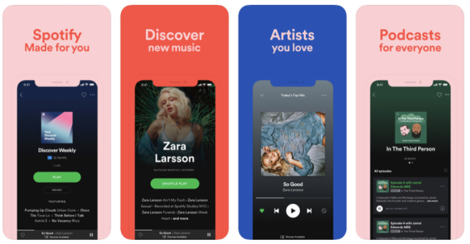
The user interface is, therefore, developed with the idea of increasing user engagement. You should also research for color gradients that go with your venture so that the interface is fun to use for the users.
2. Nike’s Convenient Chat Assistance
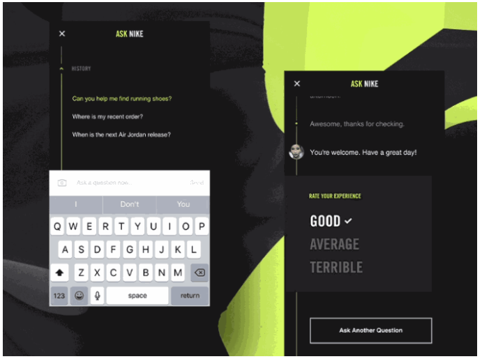
If you have any queries related to your purchase, you expect a precise answer from the providers. Chatbots and manual chat assistance is a convenient option to rectify your doubts. However, many platforms frustrate the user with their query interface and lose out on customers.
Nike has the best set of quick questions that lead you to your solution within seconds. The portal is easy to navigate and extremely time-efficient. The developers have maintained the same theme for the query portal, unlike many that have a tasteless query page.
The best way to value your customers is by offering them convenience and saving their time. You can take inspiration from Nike and learn how to appreciate your visitors by empowering the user experience.
3. Neat and Clean like Dropbox
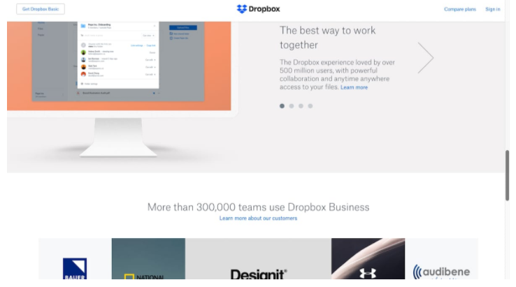
The user interface, if over-complex, can increase the bounce and reduce the visitor’s on-page time. You don’t have to offer flashy logos and unnecessary pop-ups to gain the user’s attention. You can follow a neat approach, just like the one that Dropbox offers.
It has a friendly UI, which you get used to very quickly. It reminds of the interface that a Desktop provides – icons, folders, and files. So, for a person using the website for the first time, it’ll feel just like a computer’s home screen.
4. Airbnb’s Classy Segmentation
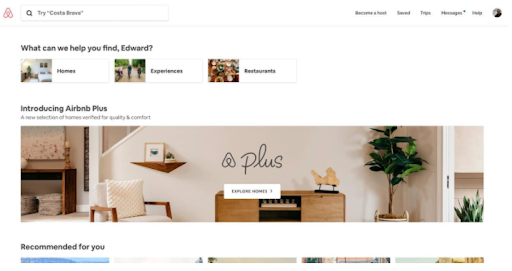
When you have a lot to offer, things can become a bit clumsy. But, with proper segmentation, you can ensure that everything is visible yet doesn’t hinder the ease-of-navigation. Airbnb’s style of aligning various services side by side resembles an e-commerce store.
If you’re stuck with the layout for your venture’s UI, you can take inspiration from Airbnb’s model. It’s subtle and ensures that the user doesn’t redirect to a false page.
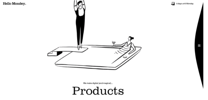
5. White Spacing like that of Hello Monday
Remember the approach of writing questions and answers with differently colored pens? It’s a practice that makes you focus on one question at a time and clearly defines its beginning and conclusion. Through apt white spacing, Hello Monday pulls off the same concept with the user experience (UX) that they offer.
It looks unique, draws attention, and, most importantly, delivers on-point information. For any budding startup that focuses on a novel aspect of living, this is an impressive web design inspiration.
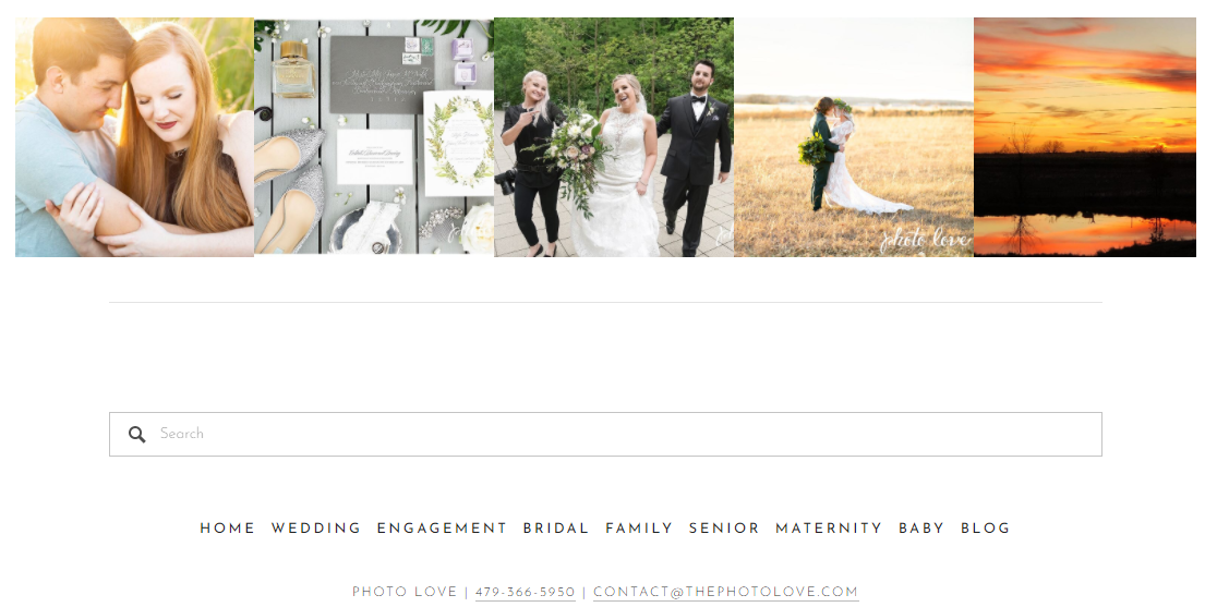
6. The Photo Love’s Multiple Search Options
As a webmaster, you know more about your website than anyone else. For the same reason, what might appear easily accessible to you won’t be the same for visitors. To solve this issue, you can develop a UI that offers multiple search options for the users.
You can use headings, individual web pages, search bar, and image-based search options to offer ease-of-access. ThePhotoLove has utilized the same mantra to ensure that users have a clear navigation path throughout their session.
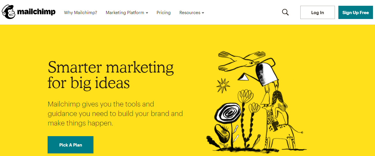
7. Usability like MailChimp
MailChimp has to be in the list of inspirational UI/UX designs simply because of its regular interface updates. Their developers modify the user interface as per the latest trends to ensure that the website doesn’t reflect an outdated look.
That’s a key takeaway for your web design too. Keep the UI up-to-date and filter all the non-essential components to enhance web usability. Don’t go overboard with web modifications and implement only the ones that incline with your offerings.
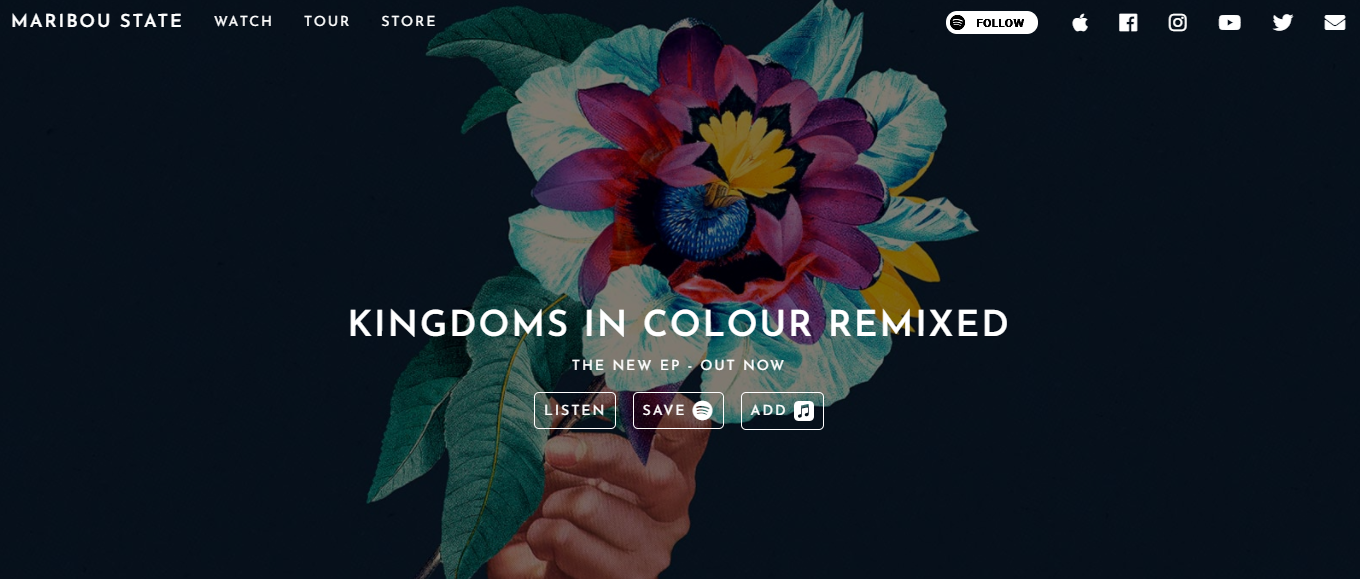
8. Maribou’s Media Animations
Music and animations go hand-in-hand, and Maribou Player’s website takes it to a new level. It has a media player that’s so soothing to the eye that you’ll keep the screen “on” even while listening to MP3 music.
Their songs, their UI, and their story – everything has the feeling of motivation and courage imbibed to the fullest. You can take inspiration from their animations and develop unique ones that align with your venture’s interest.
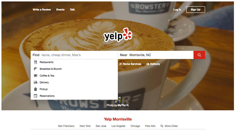
9. Yelp’s Attention to Detail
Yelp has the tagline, “Everything Findable,” and that’s indeed the case. The user experience (UX) doesn’t get any better for a website that finds you places and delivers products. The UI is very interactive and takes a lot of input from the user to produce accurate results.
With so many options and so many locations, things can go haywire. But, if you have an interface inspired by Yelp’s, you can manage stuff with ease. It’s about data precision and regularly updating the database as well.
10. Clickability like Pinterest
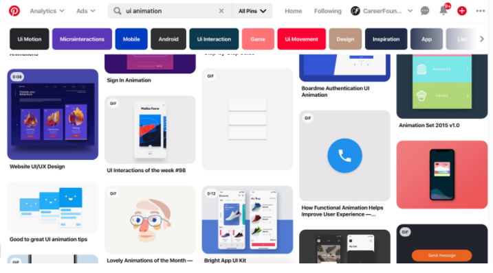
Anyone who has used Pinterest knows that it’s difficult to skip a post that you see there. The credit for the same goes to its attractive UI and the “your interests” questions that it asks you at the beginning. When you see stuff that you care about, you cannot help yourself without clicking it.
The wide array of colors used to define the various website elements also adds to its compelling UI/UX design. Having content on so many existential elements in and yet delivering it so smoothly is something to learn from Pinterest.
To Conclude
This concludes the listing of 10 inspirational UI/UX design examples. You can use them as a standard to maintain the quality of UI that you offer to your audience. Don’t be afraid to experiment with the interface you provide, but be quick enough to modify it according to the audience’s demand.
Have more UI designs to add to the list? Write a guest post for us and share your knowledge with our audience by clicking here.