
Color Psychology in Graphic Design: Creating Emotional Connections
In the world of graphic design, color plays a vital role in creating visual impact and evoking emotional responses. Understanding the principles of color psychology can empower designers to effectively communicate messages, establish brand identities, and forge emotional connections with their audience. In this blog, we will explore the significance of color psychology in graphic design and how it can be leveraged to create powerful visual experiences.
The Power of Color Psychology
Color has the remarkable ability to influence our emotions, perceptions, and behaviors. Different colors evoke distinct psychological responses, making them a potent tool for designers to shape the narrative and impact of their creations. By strategically employing colors, designers can create visual experiences that resonate deeply with viewers, eliciting specific emotions and fostering strong connections.
Red: Passion, Energy, and Urgency
Red is a vibrant and intense color that evokes strong emotions. It symbolizes passion, energy, and excitement. It grabs attention and stimulates the senses, making it ideal for creating a sense of urgency or conveying strong emotions in designs. Red is often used in calls-to-action, as it encourages action and triggers a sense of urgency.
Blue: Trust, Calmness, and Stability
Blue is a calming and trustworthy color that often evokes feelings of stability and reliability. It is commonly associated with trust, loyalty, and professionalism. Blue is frequently used by financial institutions, healthcare providers, and tech companies to instill a sense of security and confidence in their audience. Lighter shades of blue can create a soothing and tranquil atmosphere.
Yellow: Happiness, Optimism, and Creativity
Yellow is a vibrant and joyful color that represents happiness, optimism, and creativity. It grabs attention and radiates positive energy. Yellow is often used to convey a friendly and cheerful brand personality. It can be an effective choice for designs related to entertainment, children’s products, or anything that aims to evoke a sense of joy and playfulness.
Green: Nature, Growth, and Harmony
Green is associated with nature, growth, and harmony. It symbolizes freshness, renewal, and balance. Green is commonly used in designs related to health, wellness, and environmental sustainability. It can create a sense of tranquility and connection to the natural world. Darker shades of green can evoke feelings of stability and wealth.
Purple: Luxury, Creativity, and Spirituality
Purple is often associated with luxury, creativity, and spirituality. It is a color that sparks imagination and inspiration. Purple can be used to convey a sense of elegance, sophistication, and uniqueness. It is often employed in designs related to beauty products, luxury goods, and artistic endeavors.
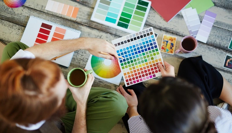
Using Color Harmonies and Contrasts
In addition to understanding the emotional associations of individual colors, designers must also consider color harmonies and contrasts. Harmonious color combinations create a sense of balance and visual appeal. Examples include complementary colors (opposite colors on the color wheel, like blue and orange) and analogous colors (adjacent colors on the color wheel, like blue, green, and teal).
Contrasting colors, on the other hand, create visual impact and draw attention. For instance, the combination of black and white or the use of a vibrant color against a neutral background can create a striking visual effect.
Color psychology is a powerful tool in the arsenal of graphic designers, allowing them to create emotional connections, establish brand identities, and effectively communicate messages. By understanding the psychological associations of different colors and leveraging color harmonies and contrasts, designers can create visual experiences that evoke specific emotions and leave a lasting impact on their audience. Whether it’s igniting passion with red, instilling trust with blue, or inspiring creativity with purple, color choices can transform a design into a powerful medium for emotional connection. So, embrace the language of colors and explore the endless possibilities they offer in your graphic design endeavors.
When applying color psychology in graphic design, it is important to consider the context and target audience. Different cultures and demographics may have varying interpretations of colors, so it’s essential to conduct research and understand the preferences and cultural connotations associated with specific colors.
Moreover, it’s crucial to maintain consistency across brand assets and marketing materials. Establishing a cohesive color palette that aligns with the brand’s identity and values helps create a recognizable visual identity. Consistency builds trust and strengthens brand recognition, allowing the audience to form a deeper connection with the brand over time.
Beyond color selection, the use of color psychology can extend to typography, imagery, and overall design composition. These elements work together harmoniously to convey a specific mood or message. For instance, pairing bold typography with vibrant colors can create a sense of excitement and energy, while using softer hues and delicate imagery can evoke a feeling of tranquility and relaxation.
Incorporating color psychology into your graphic design process requires experimentation and creative exploration. Take the time to test different color combinations and assess their impact on the overall design. A/B testing can be a valuable technique to measure the effectiveness of color choices and fine-tune your design strategy.
Additionally, it’s important to stay informed about current design trends and innovations. The field of graphic design is constantly evolving, and new color combinations and techniques emerge regularly. By staying up-to-date with the latest trends, you can infuse your designs with fresh and captivating visuals that resonate with contemporary audiences.
In conclusion, color psychology is a powerful tool that allows graphic designers to create emotional connections and captivate their audience. By understanding the psychological associations of colors, leveraging harmonies and contrasts, and considering the context and target audience, designers can elevate their creations to new heights. So, embrace the vibrant world of color psychology, experiment fearlessly, and let your designs forge deep and meaningful connections with your audience.