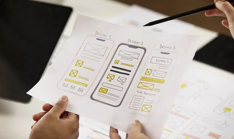
Mobile-First Landing Page Design: Optimizing for Small Screens and On-the-Go Users
In today’s mobile-dominated world, having a mobile-first approach to website design is no longer optional—it’s essential. Mobile devices account for a significant portion of web traffic, and users expect seamless browsing experiences, especially when landing on a website for the first time. In this blog post, we will explore the importance of mobile-first landing page design and provide valuable tips for optimizing your landing pages for small screens and on-the-go users.
Understand the Mobile User Experience
Designing a mobile-first landing page starts with understanding the unique needs and behaviors of mobile users. Mobile users are often on the move, multitasking, and have limited attention spans. They expect fast-loading pages, easy navigation, and concise content that quickly communicates the value proposition. Keep these factors in mind as you craft your mobile landing page design.
Prioritize Page Speed
Mobile users are typically looking for quick answers or solutions, so page speed is crucial. Optimize your landing page for fast loading times by minimizing file sizes, compressing images, and leveraging caching techniques. Regularly test your page’s speed using tools like Google PageSpeed Insights or GTmetrix to identify areas for improvement. A fast-loading landing page not only improves user experience but also positively impacts your search engine rankings.
Simplify Navigation
On a small mobile screen, it’s essential to simplify navigation to ensure ease of use. Use a clean, uncluttered layout with a clear and easily accessible navigation menu. Avoid overwhelming users with excessive options or complex menus. Instead, focus on providing the most important and relevant navigation links that guide users to the key sections of your landing page.
Create Clear and Compelling Call-to-Actions (CTAs)
Mobile landing pages should have prominent and clear call-to-action (CTA) buttons that are easy to tap on small screens. Make sure the CTAs stand out visually by using contrasting colors and strategic placement. Use concise and action-oriented text that communicates the value or benefit of taking the desired action. Optimizing CTAs for mobile devices can significantly improve conversion rates.
Use Responsive Design
Responsive design is crucial for mobile-first landing pages. It ensures that your landing page adapts and displays correctly across various screen sizes and orientations. Use fluid layouts, flexible images, and scalable typography to create a seamless experience across different devices. Test your landing page on different mobile devices and screen sizes to ensure consistent and optimized rendering.
Prioritize Concise and Scannable Content
Mobile users tend to skim and scan content rather than reading every word. Therefore, it’s crucial to deliver concise and scannable content on your landing page. Use short paragraphs, bullet points, and headings to break up text and make it more digestible. Focus on delivering key messages and benefits concisely, using persuasive and engaging language to capture and retain users’ attention.
Optimize Images and Media
Visual elements play a significant role in mobile-first landing page design. Optimize images and media files for mobile devices to ensure fast loading times without compromising quality. Use compressed images, lazy loading techniques, and consider using alternative formats, such as WebP, for better mobile performance. Avoid using large or unnecessary images that can slow down your landing page.
Incorporate Mobile-Friendly Forms
If your landing page includes a form, make sure it is mobile-friendly. Use responsive form fields and labels that adjust to small screen sizes. Minimize the number of form fields and use autofill or autocomplete where possible to streamline the input process. Implement smart validation and error handling to guide users and prevent frustration.
Test and Iterate
Testing is crucial for mobile-first landing page design. Conduct user testing and gather feedback to identify any usability issues or areas for improvement. Test your landing page on different mobile devices, operating systems, and browsers to ensure cross-compatibility. Pay attention to user behavior through analytics data to identify any drop-off points or areas of user confusion. Use the insights gained from testing to iterate and refine your mobile landing page design.
Monitor Performance and Optimization
Mobile-first landing page design is an ongoing process. Continuously monitor the performance of your landing page using tools like Google Analytics or heatmaps to gain insights into user behavior and identify areas for optimization. Regularly update and optimize your landing page based on data-driven decisions. A/B testing different design elements, CTAs, or content variations can help you uncover the most effective approach to engage mobile users.
Designing mobile-first landing pages is no longer a choice—it’s a necessity in today’s mobile-centric digital landscape. By understanding the unique needs of mobile users, prioritizing page speed, simplifying navigation, and optimizing CTAs, you can create landing pages that captivate on-the-go users and drive conversions. Embrace responsive design principles, focus on delivering concise and scannable content, and optimize media elements to ensure a seamless mobile experience. Regular testing, monitoring, and optimization will enable you to fine-tune your mobile landing pages for maximum impact. By implementing these best practices, you’ll be well-equipped to create mobile-first landing pages that engage, convert, and delight your mobile audience.